Gray scale
Taken multiple photos and gray scale them to examine how the lighting reacts to the area, how it affects the environments in terms of it's tone and the different between each hour of the day and night. Using the photos that I've take from a few days an others from the past.
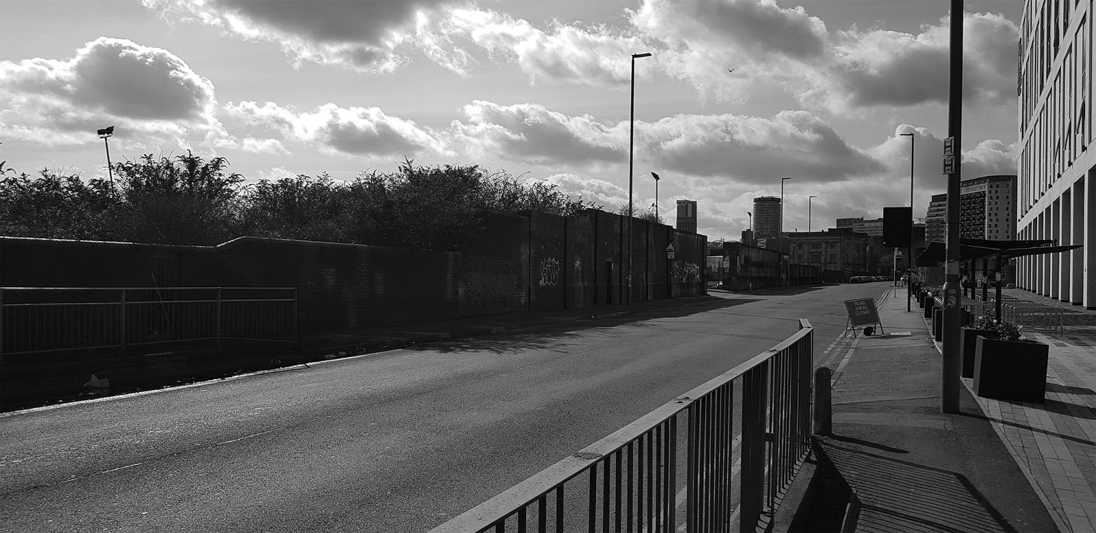
Looking through each photo and seeing how the brightness is displayed and the lighting affects the area, where certain parts of the surface may look clear and bright while other may look a bit faint and darker, that the sun is aiming in that direction in that time from viewing what parts are projecting the light source facing towards the sun and what isn't. The brightness scale also shows what time of day it is even with the clouds which could invoke what the weather is like just from viewing the image.
It also help me to know how shading would work within my drawings
 |
| Before |
 |
| After |
It also help me to know how shading would work within my drawing, picking one of my previous drawings to have some shading and the results were quite effective making the sketch look more 3D, the generally direction of where the sun is coming from and how shadows react to the environments, involving the trees, house, pillar, surface and the character. where some of the shading would be misplaced on specific surfaces that different shapes and size, misplacing the shadow in a different area. With the added shading it make the drawing look slightly better than before, though it took quite sometime to getting all of the shading done because how much stuff there was in the drawing and trying to make sure that the shadows are not misplace and are the correct size. Also some of the shading may look a bit off and might not match with the direction of the sun with the other shadows and that more referencing and experimentation may need to be further improve my skills with lighting and give me a hint as to how colours would react to shading as well.
 |
| Before |
 |
| After version 1 |
 |
| After version 2 |
The other sketch came out looking appealing with the added shading having some extra bits of layer to the area and character to make them look more 3 dimensional giving a clear feeling of what time it is and how the area reacts to the sun's brightness. Much similar to how the previous sketch is presented and how much shading can make a change, though the first version I was to sure of certain parts of the trees and felt that it had way too much shading on them and changed in the second version and look a bit better but still need some work, overal I am satisfield with the end results and hope that my skills improve over time and that they bring a good sense of the location in terms of time and weather conditions.


Comments
Post a Comment